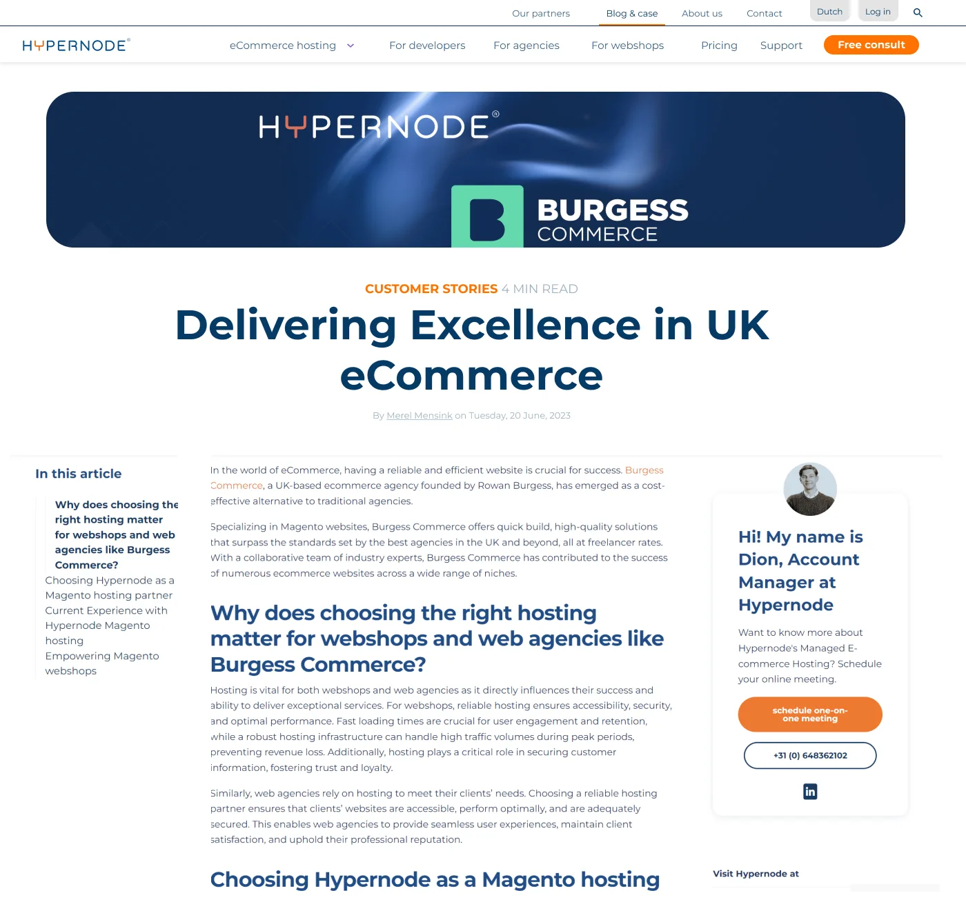
The beginning
Hypernode to firma oferująca zaawansowane narzędzia do nadzoru i konfiguracji hostingu dla branży eCommerce i aplikacji Magento, Shopware, WooCommerce i innych.
W tym projekcie chcieliśmy odświeżyć stronę, uspójnić komunikację i przygotować ją na rynek międzynarodowy pod kątem UX i UI. W grę wchodził audyt strony i redesign identyfikacji.
Drag
Redesign
Przeprowadziłam audyt strony i na jego podstawie zaprojektowałam nowe, odświeżone i uporządkowane karty.
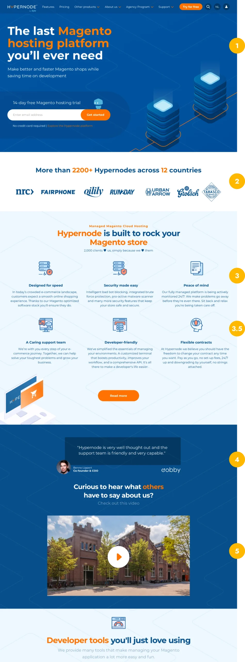
Strona główna jest jedną z najważniejszych stron, na jakiej lądują użytkownicy. Poniżej przedstawiam skrócony audyt strony głównej z najważniejszymi problemami.
Strona główna jest jedną z najważniejszych stron, na jakiej lądują użytkownicy. Poniżej przedstawiam skrócony audyt strony głównej z najważniejszymi problemami.
Before
1
Hierarchy & Clarity
Użytkownik ląduje na stronie głównej, której pół ekranu zajmuje nie do końca jasna grafika, a do tego atakują nas ze wszystkich stron pomarańczowe akcenty. Utrudnia to skupienie się na przekazie, a CTA staje się mniej wyraźne, mniej interesujące.
2
Familiarity
Po zapoznaniu się dopiero z pierwszą sekcją, użytkownik nie wie jeszcze czym jest „Hypernode”. Czy jest to firma, aplikacja, serwer, czy sklep. Dodatkowo pokazujemy tutaj tylko 7 statycznych logo współpracujących firm.
3
Cognitive load
Ponownie bombardujemy odbiorcę wieloma elementami na raz – ponad 5 kolorami, innym tłem, emotkami serduszek, kolorowymi ikonami i tekstem, który, mimo, że najważniejszy w tej sekcji, ginie pomiędzy wyrazistymi elementami.
4
User interaction & social proof
Pokazujemy jedną opinię na raz, która trwa 5s, zanika, i pojawia się kolejna. Odbieramy w ten sposób użytkownikowi możliwość interakcji i sprawdzenia kilku opinii w tym samym momencie, a tym samym zbudowania pozytywnego wizerunku firmy w krótszym czasie.
5
Outdated content
Mimo, że bardzo polecam stosowanie filmu na stronach internetowych, obecny film był już nieaktualny pod kątem miejsca, ludzi i produktu (który znacznie się rozbudował w ostatnim czasie).
6
Professional and modern look
Oprócz w.w. problemów, mamy również 3 różne kolory tła i grafikę w tle, przez co strona wydaje się przestarzała. Brakuje jasnego przekazu i misji firmy/produktu. Dodatkowo na całej stronie głównej znajdowały się zaledwie 3 CTA, z czego jedno prowadziło po prostu do „read more”.
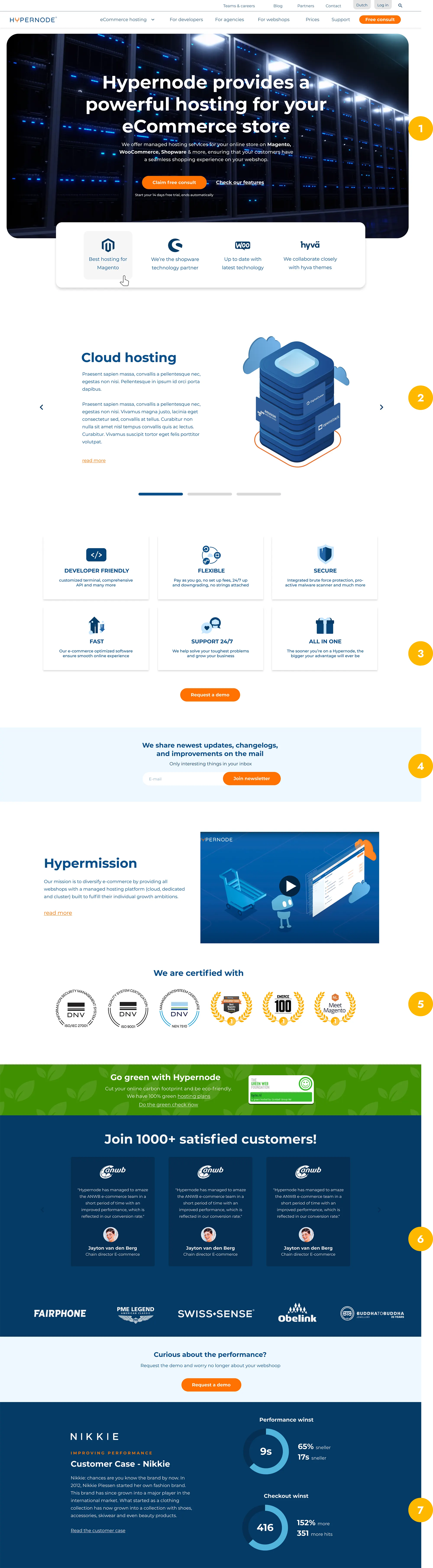
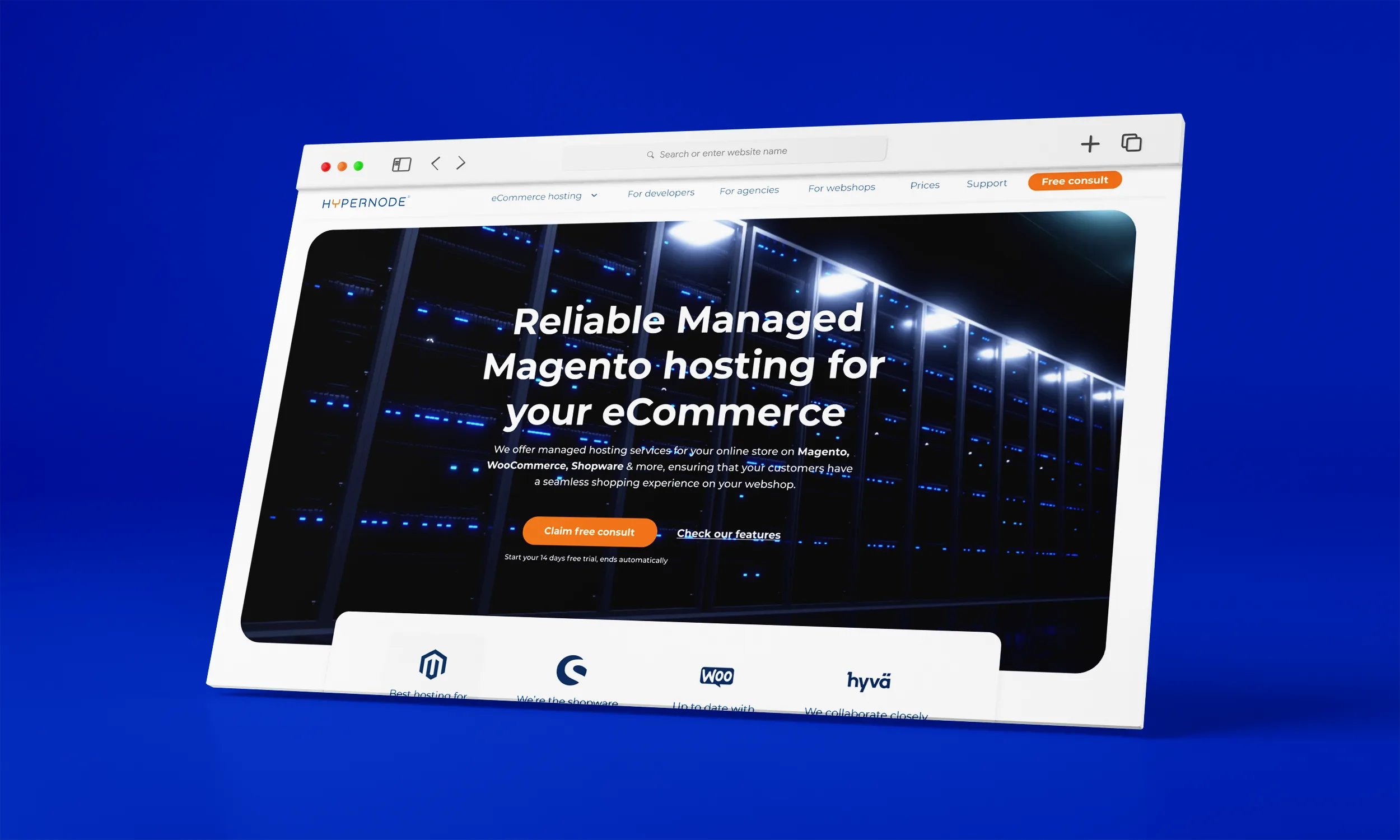
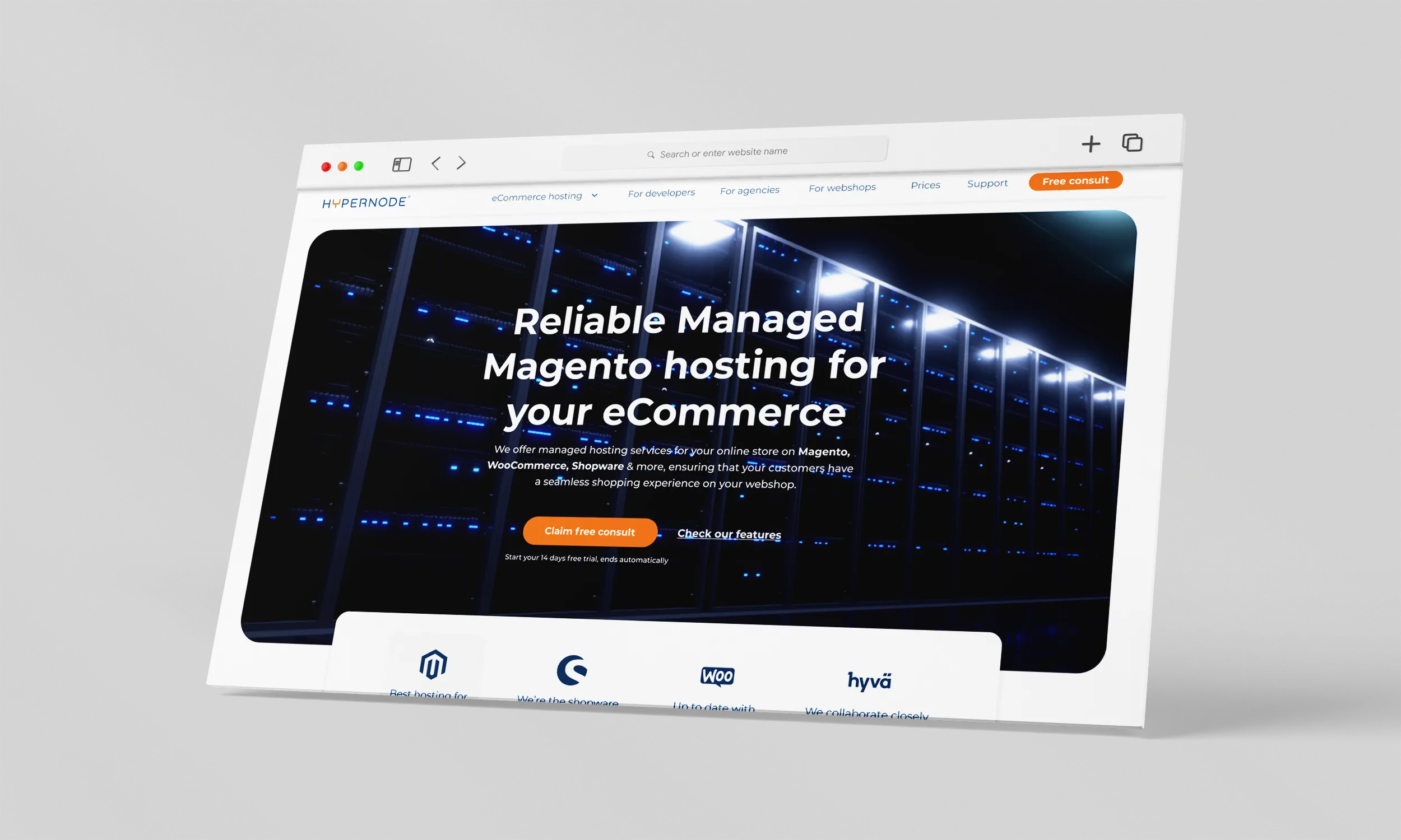
After
Chcąc wyjść na rynek międzynarodowy skupiłam się również, poza poprawą powyższych błędów, na odświeżeniu wyglądu, dostosowaniu do obecnych standardów i podkreśleniu profesjonalizmu firmy.
1
Hierarchy & Clarity
Cała sekcja główna znajduję się na jednym ekranie, dzięki czemu użytkownik dowiaduje się z pierwszych zdań czym jest Hypernode i co oferuje. W tle zamiast zwykłej grafiki dałam zapętlone, wolne video tematyczne. Ograniczyłam kolory do minimum chcąc całkowicie skupić uwagę użytkownika na CTA – darmowej konsultacji. Od teraz pomarańczowy będzie tylko akcentem.
2
Hidden content
Dla użytkowników, którzy chcą zgłębić temat, pojawiły się również sekcje poziome przedstawiające w bardziej szczegółowy sposób ofertę Hypernode. Dodatkowo wewnętrzne linkowanie i więcej tematycznej treści poprawia pozycjonowanie SEO.
3
Key-points
Tak jak w poprzedniej wersji przedstawiłam najważniejsze cechy Hypernode, z nowymi ikonami i krótszą, równie informującą treścią. Dzięki temu użytkownik może zapoznać się ze wszystkimi elementami w krótszym czasie, a dokładniejsze informacje znaleźć na osobnych podstronach.
4
Multiple CTA
Na tym etapie użytkownik wie już, czym jest Hypernode i co oferuje, więc możemy ponownie wykorzystać CTA i spróbować zamienić wizytę w konwersję. Dla użytkowników, którzy nie chcą jeszcze zostać klientami, ale są zaciekawieni ofertą dodałam osobny przycisk do newslettera.
5
Build trust
Dla spójności z wartościami firmy, jakimi są: bezpieczeństwo, performance i szybkość serwerów, dodałam specjalną sekcję certyfikatów ISO. Budowanie pozytywnych wrażeń i zaufania nie musi odbywać się tylko za pomocą opinii.
6
User interaction & social proof
Jedną opinię zamieniłam na 3, dodatkowo jest to karuzela, dzięki czemu użytkownik sam może przesuwać i czytać kolejne opinie. Podobnie z zaufanymi partnerami, jest to karuzela automatyczna, dzięki czemu możemy zmieścić więcej logo i zbudować wizerunek większej i bardziej nowoczesnej firmy.
7
Customer case
Dodałam również Customer Cases, czyli krótkie historie sklepów internetowych i ich wyników przed i po skorzystaniu z oferty Hypernode. Jest to kolejna opcja zbudowania wizerunku rzetelnej i skutecznej firmy, w dodatku bardziej logiczna niż same w sobie opinie.
8
Consistency
Usunęłam z tła grafikę linii izometrycznych i zamieniłam je na standardowe białe tło. Sekcje dla odznaczenia, takie jak opinie, customer case czy newsletter są w odcieniach niebieskiego, a pomarańczowy został jako kolor CTA i akcent. Wprowadziłam również więcej interakcji i animacji, dzięki czemu użytkownik może wejść w interakcję ze stroną i dłużej na niej zostać, co również wpływa pozytywnie na SEO.
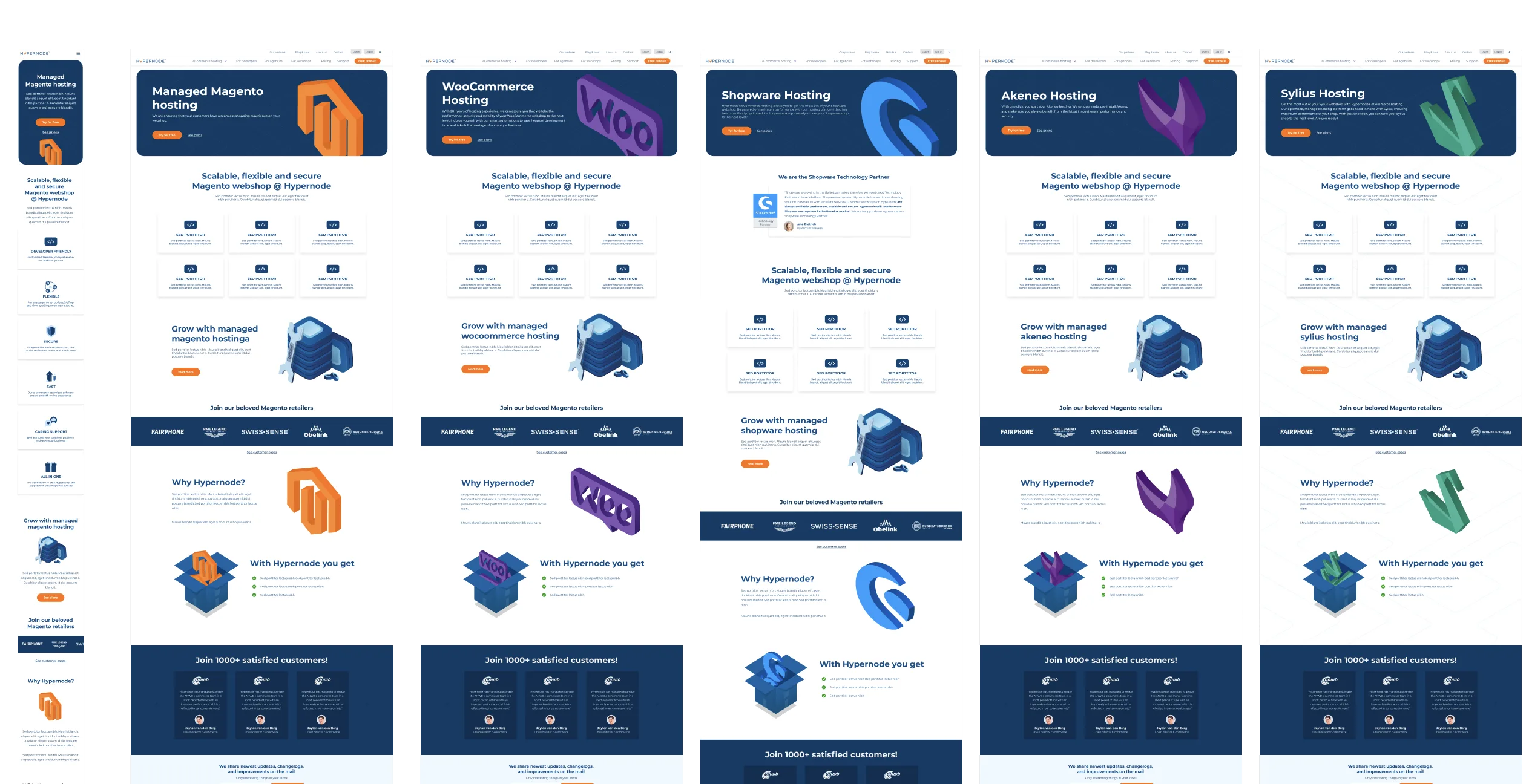
I ruszyła maszyna
Analogicznie do strony głównej przeprojektowaliśmy i przebudowaliśmy ponad 20 innych podstron. Poniżej możecie zobaczyć kilka efektów przed-po :).
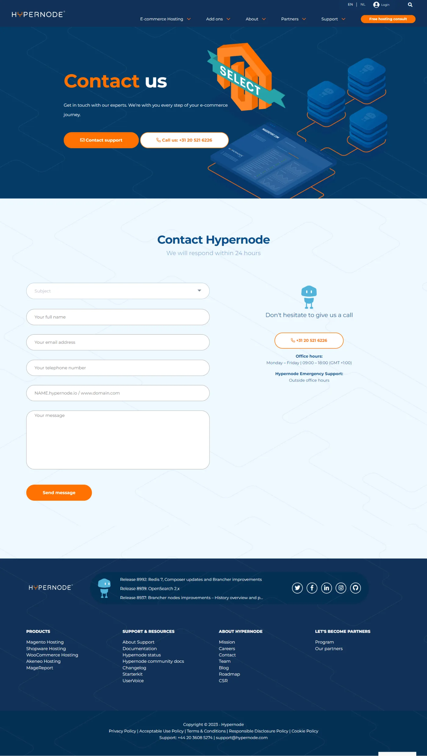
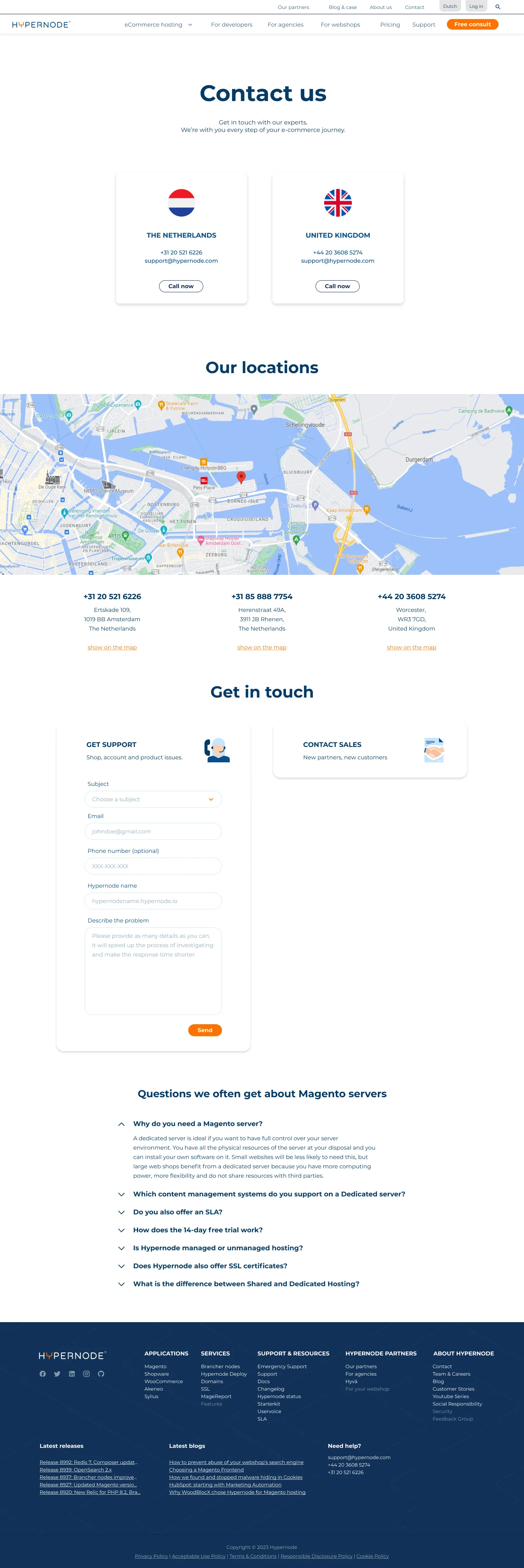
Kontakt przed i po
Najważniejsze zmiany: dodanie numerów i maili dla UK, dodanie mapy dojazdu, przyjazny formularz z rozdzieleniem na agencje i właścicieli sklepów.
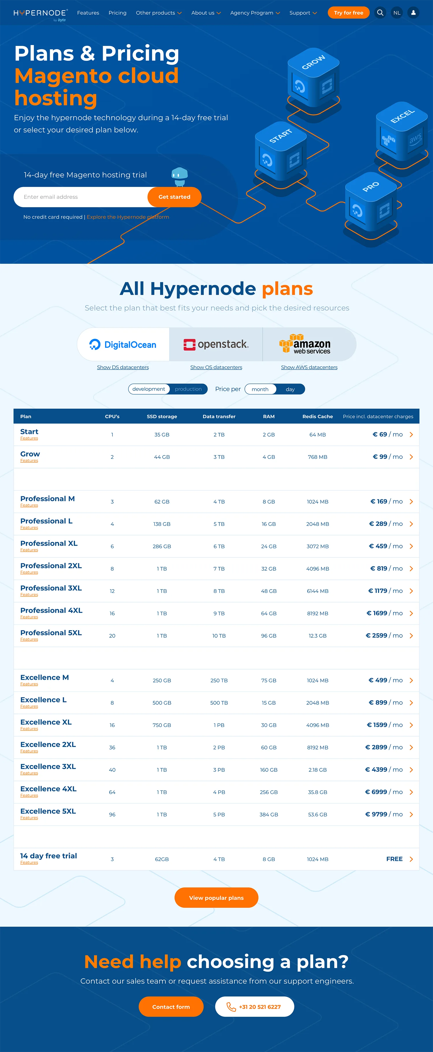
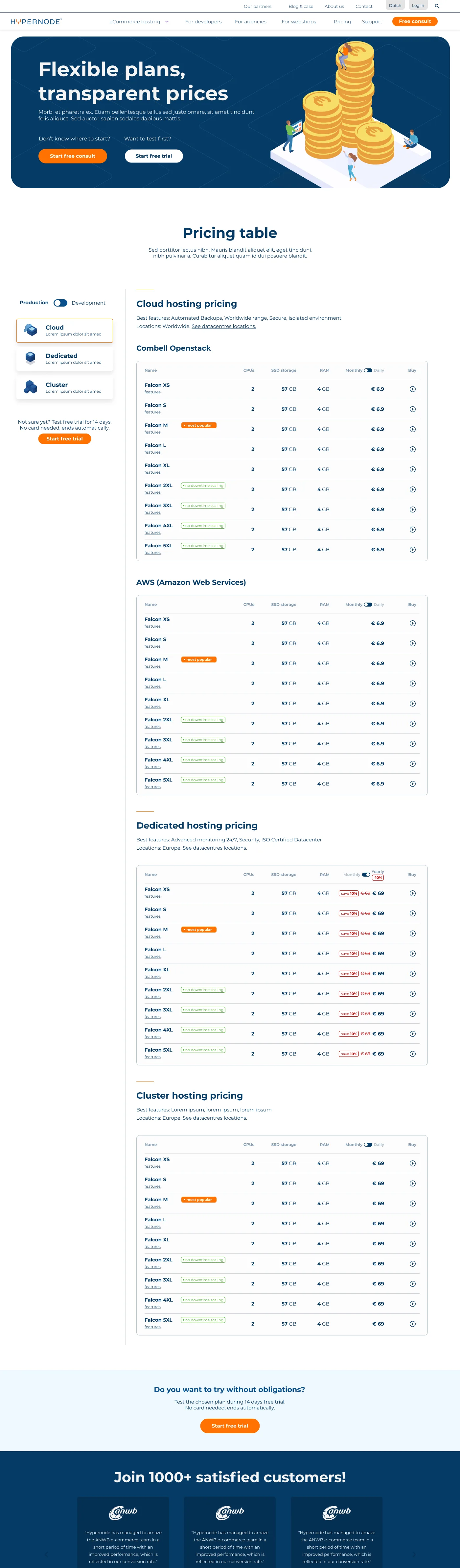
Cennik przed i po
Najważniejsze zmiany: dodanie filtrów i CTA zawsze widocznych na ekranie dla łatwiejszej nawigacji, dodanie rozdzielenia monthly/yearly, dodanie etykiet „popularnych” i „polecanych”.
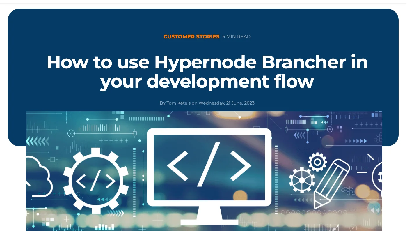
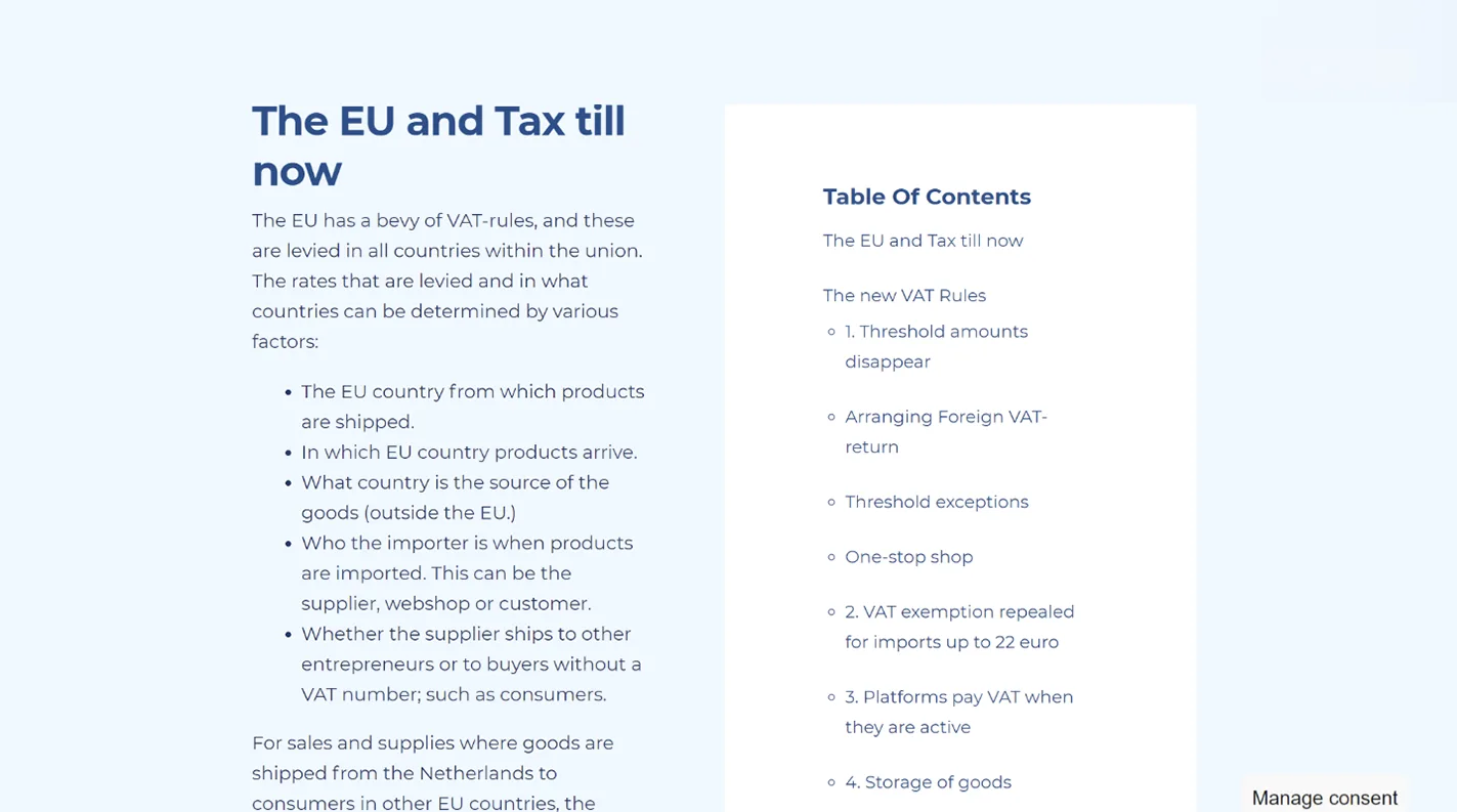
Blog przed i po
Najważniejsze zmiany: uporządkowanie okładki i tytułu oraz kategorii, zwiększenie szerokości czytanego tekstu na 700px (zalecana szerokość treści), dodanie statycznego CTA oraz spisu treści (zawsze widocznego na ekranie).
Do you have an idea?
I will find the time, attention, and passion for you. Get in touch and let's create something wonderful together!